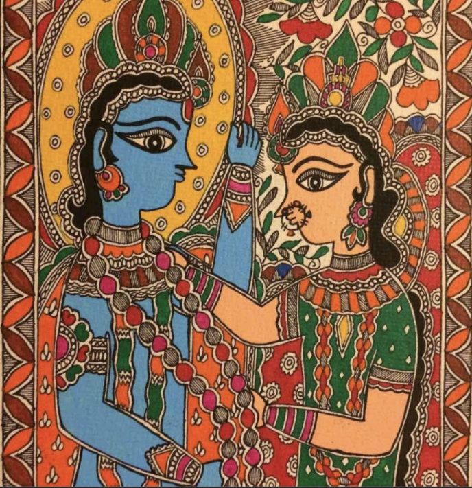
In the collective consciousness of the Mithila region, a geographic territory spanning North Bihar in India and the Madhesh Province of Nepal: Madhubani painting is an art form born of a divine mandate. Local oral histories track its origins to the Ramayana, asserting that King Janaka commissioned village women to paint the walls of their mud homes to celebrate the wedding of his daughter, Sita, to Prince Rama.
Anthropologically, however, the art form operates as an ancient, matriarchal knowledge system. For centuries, it existed entirely outside the commercial art market, hidden from public view inside the private domestic spaces of rural huts. Passed down rigorously from mother to daughter across generations, it served as an ephemeral visual prayer, a communal bonding ritual, and a domestic technology for marking sacred time and space.
This article further elaborates on how this matrilineal system has composed and preserved this facet of science and beauty through it’s intricate pigment chemistry, geometric patterns and narrative depictions.
THE CORE VISUAL SYSTEMS
The art form operates as an advanced graphic system where different visual formats are used to achieve specific spatial, textural, and energetic goals. These are divided into five distinct design systems:
1. Bharni: The Filled-Color System
The Bharni (literally, “to fill”) layout is the primary colorist system of Mithila. It focuses on achieving intense visual dominance and psychological weight through flat, unmodulated color fields.
- The Blueprint: Artists outline form using thick, broad, decisive black borders. The interior spaces are then flooded entirely with vibrant, raw pigments. Shading, gradients, and three-dimensional depth are strictly forbidden.
- The Design Application: Because it relies on flat color-blocking rather than intricate detail, the Bharni system creates powerful visual weight. In contemporary interior architecture, this system scales beautifully onto large feature walls, murals, or public installations where bold graphic presence is required to anchor a space.
2. Kachni: The Fine-Line Constraint
The Kachni (meaning “line work”) layout represents the ultimate monochrome or duotone constraint. It completely isolates the brush from solid paint fields, forcing the artist to create texture using only the tip of the pen.
- The Blueprint: Interior color fills are entirely rejected. The spaces within the mandatory double outlines are texturized using hyper-dense parallel hatching, delicate cross-hatching, stippling, and fine concentric curves.
- The Design Application: Kachni is the historical precursor to modern minimalist line art. Its absolute reliance on line weight over color makes it highly compatible with Scandinavian, industrial, or neutral interior aesthetics. It functions flawlessly as framed fine art prints, laser-engraved partition screens, or elegant editorial packaging graphics.
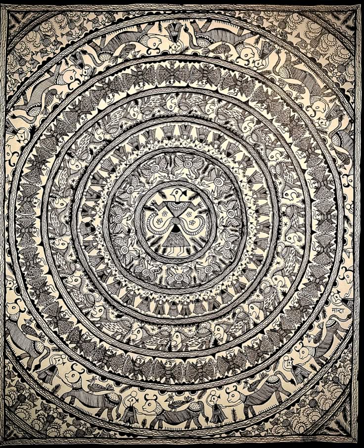
3. Tantrik: The Esoteric Mandala Layout
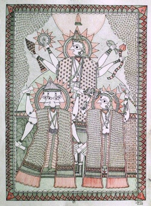
The Tantrik system is a highly disciplined graphic framework centered on sacred geometry and non-narrative cosmic diagrams. It operates as an ancient identity system for invisible forces.
- The Blueprint: The layout organizes space around strict linear structures, Yantras (sacred power diagrams), and circular Mandalas. It features sharp, angular geometry mixed with symbolic depictions of primordial energy fields, emphasizing mirror-image symmetry and radiating geometric paths.
- The Design Application: The mathematical precision of the Tantrik system appeals directly to modern graphic designers and typographers. Its focus on balanced, circular, and grid-based geometry provides an incredible reference blueprint for contemporary logo marks, luxury branding seals, and meditative spatial layouts.
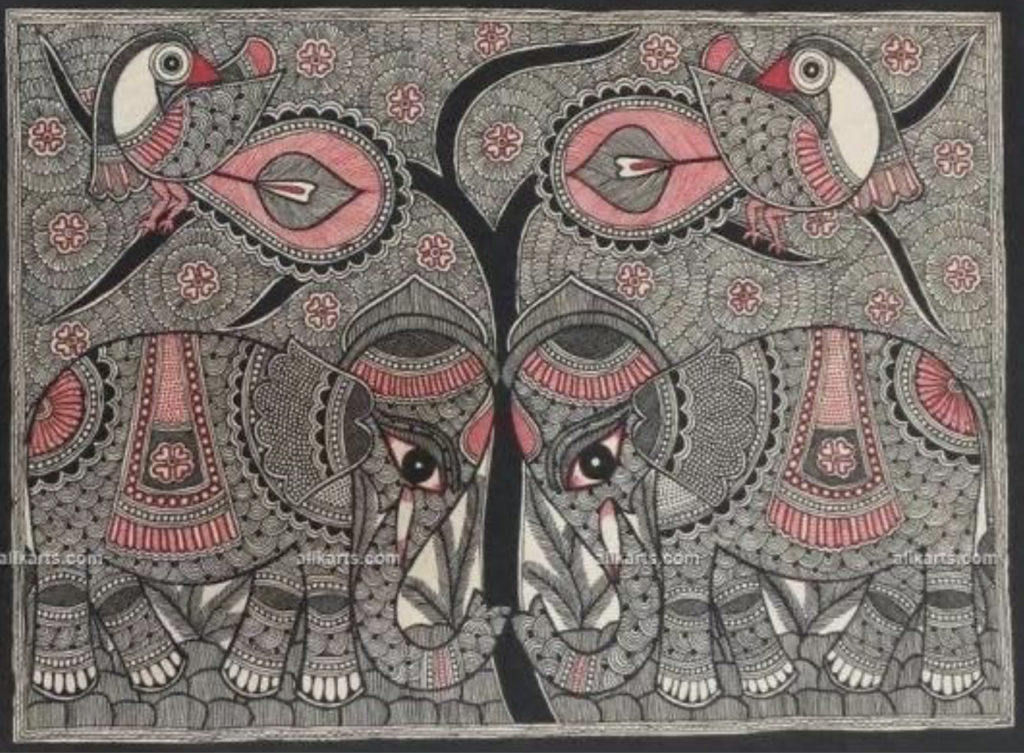
4. Godna: The Continuous Tattoo Lattice
The Godna (tattoo) system completely abandons mythic storytelling and human-centric profiles in favor of pure, infinite abstraction and mechanical rhythm.
- The Blueprint: This format treats the canvas as a continuous field where small, distinct organic symbols—such as stylized wheels, geometric birds, and repeating trees—are systematically arranged in repeating concentric circles, horizontal linear tracks, and interlocking grid matrices. The canvas is often pre-treated with a deep, smoky wash to create a high-contrast background.
- The Design Application: Godna functions exactly like a modern digital vector pattern or a continuous textile print. Its mathematical repetition makes it exceptionally scalable for sustainable fashion apparel, wallpaper design, and luxury wrap packaging where a seamless, repeating visual texture is required.
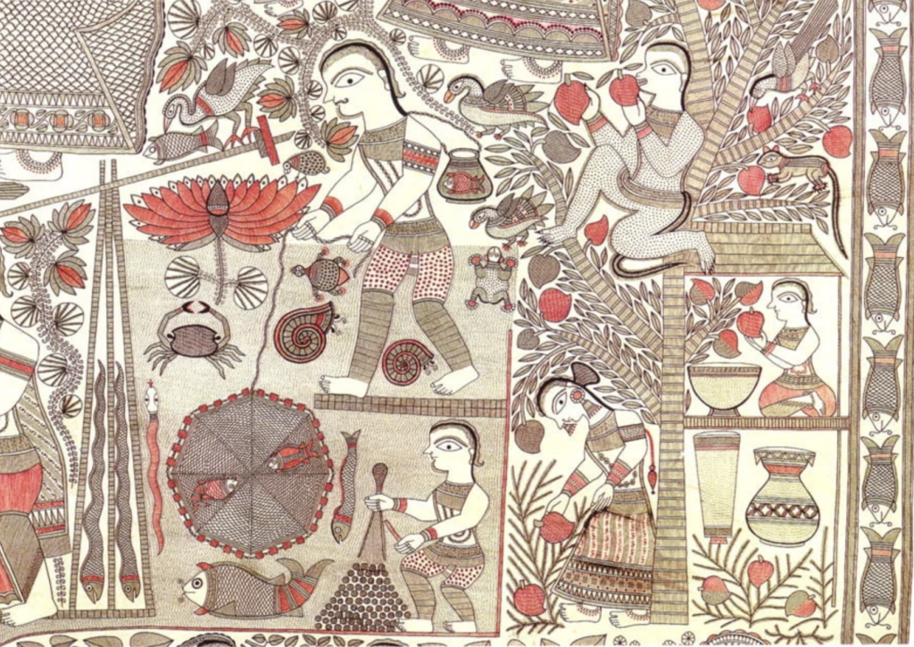
5. Kohbar: The Nuptial Ecosystem Blueprint
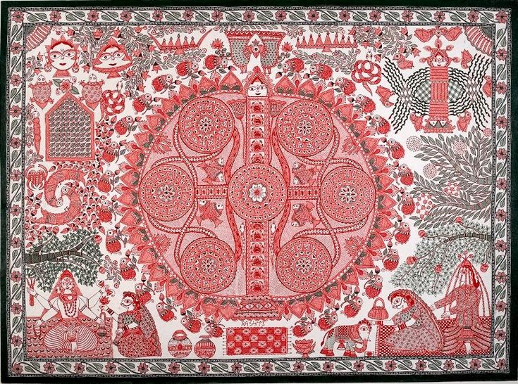
The Kohbar is the definitive biophilic system of Madhubani art. It is a highly specific, complex compositional grid that visually maps a living ecosystem to celebrate the procreation and continuity of life.
- The Blueprint: The entire space is organized around a central, commanding focal point: a massive, radiating ring of lotus leaves (Puren) pierced by a rigid vertical vector of bamboo (Vansha). The surrounding background is packed with pairs of swimming fish, tortoises, and interlocking birds, leaving absolutely no empty or sterile space on the canvas (Horror Vacui).
- The Design Application: For modern interior architects, the Kohbar layout provides a stunning template for story-driven, biophilic installations. It demonstrates how nature can be abstracted into an intentional spatial map that infuses a room with an atmosphere of creative vitality, growth, and natural abundance.
MATERIAL SCIENCE AND VERNACULAR CHEMISTRY
To view Madhubani art purely through an aesthetic lens is to miss its foundational genius: its materiality. Long before the 1960s introduced synthetic acrylics and chemically uniform inks, Mithila artisans functioned as empirical chemists, deeply attuned to the local ecology and the molecular behaviour of organic matter. The materials of Madhubani art form a highly sustainable, closed-loop design system where the physical medium and the visual message are ecologically bound.
1. The Engineering of the Bamboo Pen (Kalam)
The primary drawing instrument is the kalam, a stylus hand-carved from local bamboo stalks.
- The Reservoir System: To overcome the rigid, non-porous nature of raw wood, artists wrap a small wad of unspun cotton or raw rag around the bamboo shaft just above the split, pointed nib.
- The Mechanics: When dipped into organic ink, this cotton mass acts as a manual capillary reservoir. As the artist applies pressure to the canvas, the cotton slowly releases the fluid down the nib. This creates a living, fluctuating line weight that pulses based on human pressure, a graphic organic imperfection that modern vector software cannot authentically replicate.
2. The Biochemistry of Canvas Priming and Fixing
- The Anti-Fungal Base (Gobar Wash): Mud walls and contemporary handmade papers are pre-treated with a diluted wash of fresh cow dung (gobar). Beyond its ritual significance, this acts as a practical primer: the natural enzymes in cow dung serve as an anti-fungal protectant, preventing the paper fibres from rotting in a humid, monsoon-prone climate. It also tints the canvas with a warm, desaturated, stone-neutral undertone that grounds the entire color story.
- The Natural Polymer Binder (Gond): To ensure that raw mineral and plant juices adhere permanently to the cellulose fibers without flaking or powdering, the pigments are mixed with the resinous gum (gond) of the Acacia tree or the milky, viscous sap of the Banyan tree. This acts as a natural polymer, locking the colour molecules directly into the substrate.
Upon this primed surface, the extraction and stabilization of the natural palette requires an intimate understanding of chemical bounds, pH sensitivity, and oxidation. Consider the formulation of the pigments:
- Carbon Black (Soot): Harvested from the carbon residue of mustard-oil lamps, this pigment is chemically elemental carbon. To transform this volatile soot into a stable, non-smudging ink, artisans emulsified it with cow dung water or Gum Arabic (sap from the Acacia nilotica or Babool tree). The resinous polysaccharides wrap around the carbon particles, creating a permanent molecular bond with the wall’s cellulose.
- Indigotin (Deep Blue): Derived from the Indigofera tinctoria plant, indigo is entirely insoluble in water. The women utilized a natural fermentation process to reduce the indigo into its water-soluble, colorless “leuco” form. Once applied to the surface, exposure to atmospheric oxygen triggers a rapid oxidation reaction, locking the pigment into its permanent, vibrant deep blue state.
- Curcumin (Vibrant Yellow): Extracted from the rhizomes of turmeric (Curcuma longa), this polyphenolic compound is highly vibrant but notoriously pH-sensitive. Artisans balanced the acidity of their mixtures, sometimes adding the sap of the banyan tree or local lime to manipulate the pH level, chemically stabilizing the hue against immediate photodegradation.
- Iron Oxides (Geru/Ochre): Sourced from local hematite clay, these mineral pigments are chemically inert. Their resilience to air and light is why the deep reds of ancient Mithila murals endure long after organic greens, derived from unstable chlorophyll complexes in flat bean leaves, have oxidized and faded.
These women did not consult laboratory manuals. Their chemical literacy was empirical, experiential, and held entirely in the muscle memory of the hands.
RECLAIMING THE “THINKING HAND”
The story of Madhubani painting is a profound testament to the resilience of unwritten knowledge. It forces us to confront the inherent biases of our contemporary academic canons, which routinely dismiss domestic, oral, and female-led traditions as mere “craftsmanship.” By recognising the synthesis of pigment and the ritual symbolism in Madhubani art, we honour its true legacy: a monumental, unbroken archive of human intellect, preserved and transmitted through the brilliant, thinking hands of women.
CITATIONS
Archer, William G. (1949). “Maithil Painting.” Marg: A Magazine of the Arts, Vol. 3, No. 3.
Jayakar, Pupul. (1980). The Earthen Drum: An Introduction to the Ritual Arts of Rural India. National Museum of India.
Jha, Krishna Kumar & Verma, Antara. (2022). “Documentation on Traditional Madhubani Painting of Mithila: Iconography, Motifs, and Cultural Resilience.” The Pharma Journal / Bihar Museum Archives.
Mithila Melange Research Collective. (2026). “Understanding Kohbar: The Sacred Wedding Painting and Its Ecological Symbols of Abundance.” South Asian Folkloric Traditions. The Journal of Material Culture, Third Text, Marg Publications